Padparadscha sapphire is widely described as one of the rarest and most misunderstood gemstones in the world. Yet even within this rare category, some colors are significantly more common than others.
Collectors often ask:
What is the most common color of Padparadscha sapphire?
Is it orange? Is it pink? Is pastel better? Is deeper better?
The answer is more nuanced than most online guides suggest. To understand which Padparadscha colors are most common and which are least rare, we need to look at history, lab standards, and modern color stability testing.
The History of Padparadscha Sapphire
The word “Padparadscha” originates from the Sinhalese word padmaraga, meaning lotus blossom. Historically, the term referred to sapphires from Sri Lanka that displayed a delicate mixture of pink and orange, reminiscent of a tropical sunset or lotus flower. Today, origin does not limit the definition.
For decades, the term was loosely used. Many sapphires with either pinkish tones or orangish tones were labeled Padparadscha, particularly in older trade environments where lab testing was limited.
Sri Lanka was the historic source, and for many years Ceylon origin alone carried prestige. However, as new deposits were discovered Africa, the market saw more material entering the trade. This material reflected a new reality of multi color sapphire availability.
Over time, major gemological laboratories began tightening definitions. Hue balance, saturation levels, and treatment disclosure became more strictly evaluated. The loose definition of Padparadscha started to disappear.
When Did Color Stability Testing Become Standard?
Around 2018, laboratories such as SSEF, Gübelin, and GIA began emphasizing color stability testing.
Some sapphires appear perfectly pinkish orange under one light source but shift noticeably under another. Modern lab protocols now evaluate Padparadscha color under multiple lighting environments to ensure the color is stable and consistent.
Today, color stability language began appearing explicitly on reports. Accordingly, the "LMHC requires" stability testing for Padparadscha designation at leading labs.
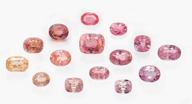
So What Is the Most Common Padparadscha Color?
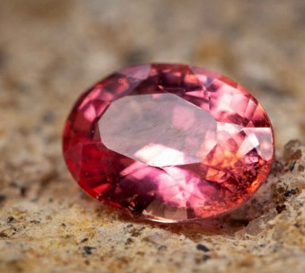
The most common Padparadscha color seen in today’s market is pastel pink leaning orange or pastel orange leaning pink.
More specifically:
- Light to medium light tone
- Pastel saturation
- Pink dominant with a secondary orange modifier
Pink Base vs Orange Base Padparadscha
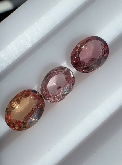
Pink Base with Orange Modifier:
This is the most common version. The stone appears primarily pink with a slight orangey glow.
Orange Base with Pink Modifier:
This is significantly less common. The stone shows a stronger orange foundation with visible pink influence layered over it.
Pastel vs Saturated Padparadscha
Most Padparadscha sapphires on the market are pastel. However, deeper saturation combined with balanced orange and pink is much harder to find.
In practice:
- Pastel pink leaning stones are the most common
- Medium saturation balanced stones are rarer
- Stronger orange-pink with good clarity and stability are rarest
Why Pink Is More Common Than Orange
(Image Courtesy of LMHC)
From a geological standpoint, chromium in corundum produces pink to red coloration. Because chromium-based pink sapphire is more abundant globally, pink dominant Padparadscha material naturally occurs more frequently. Pure orange sapphire without brown or yellow influence is much less common. When that orange also includes pink and remains stable, the combination becomes rare.
Market Impact
The most common Padparadscha colors are also generally the most affordable. Pastel pink leaning stones command lower per carat prices than balanced orange-pink stones with saturation.
Auction results consistently show that stones described as medium orangy pink with stable color and no heat outperform lighter pink leaning stones.
Final Answer
The least rare Padparadscha color is pastel pink dominant with slight orange modifier.
The rarest examples are balanced orange-pink stones with medium saturation and verified color stability.
Understanding this distinction is critical for collectors and buyers who want to distinguish beauty from rarity.

.svg)